Progress Hardware
E-Commerce Website For London Local Hardware Store
Reading Time: 5 minutes
Project Intro
I employed User Experience Design principles to implement a concept design for an e-commerce website for a fictional hardware store as part of the UX Design Immersive course at General Assembly London.
Type: Solo Concept Design Project
Duration: 2 weeks
My Role: User research done as part of a team of 5 and completed the project as solo
Platform: E-commerce website
UX Tools: User Interviews | Competitive Analysis | Contextual Inquiry | User Persona | Card Sorting | Information Architecture | Experience Map | User Journey | User Flow | Pencil & Paper | Wireframing | Lo/Mid-Fi Prototyping | Usability Testing
Software Tools: Adobe Photoshop | Sketch | Craft | InVision | Keynote
Background
Progress Hardware is a hardware store in the heart of Aldgate and it has been around since 1964.
They are proud of supporting their local community through their great services and knowledgeable staff.
Their brand personality is:
- Knowledgeable but not academic
- Friendly but not unprofessional
- Practical but not judging
- Consistent but not boring
- Proud but not arrogant
The Challenge
Design a new e-commerce website to showcase their products, while maintaining their brand image as well as keep their ‘small shop’ appeal and great customer service.
Progress Hardware’s main business requirements are:
- Have clear ways of locating specific products
- Support a single page for each product which can be linked to directly
- Have an efficient way of purchasing one or more products
- Steer customers toward popular products
- Establish the brand and its points of difference
- Allow customers to contact the business
(including to request a product not otherwise stocked)
The Process
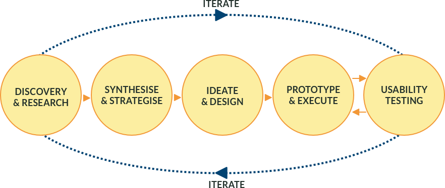
My UX process follows an iterative path and can be represented in several different ways. Adaptability is key to the digital world that is constantly evolving and changing, and my objective is to deliver incremental value to a product or a service.
Phase 1 — Discovery
Contextual Inquiry
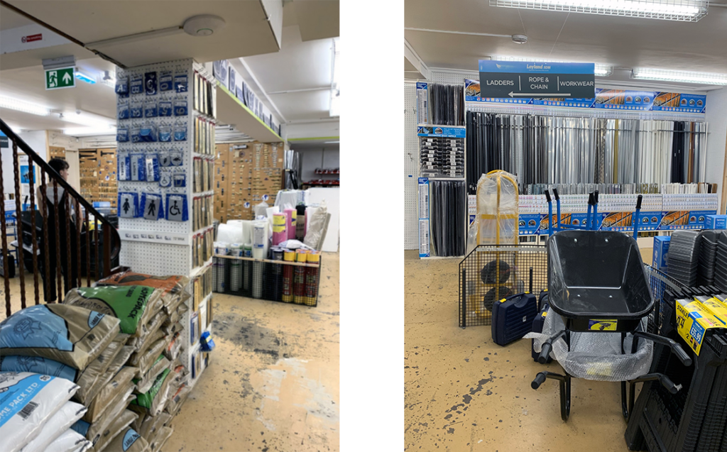
By observing clients at a similar store to Progress Hardware I gained some important insights about shoppers’ behaviour.
I also noticed how all the products were well organised, correctly labelled and frequently sold items were easily accessible.
Insights:
- Staff were helpful and attentive
- All products were organised in a logical and intuitive way
- Most shoppers were locals
User Interviews
I personally conducted 3 user interviews and, with help from my fellow students we interviewed a total of 7 participants.
Pain Points
“I don’t want to go through a lot of screens before getting to the checkout”
“Sometimes it wasn’t clear how long the delivery would take”
“I bought some furniture for my bathroom and when I got it, everything was damaged”
Motivations
“Amazon delivery is great. Next day delivery and so on… but a time-slot delivery would be very beneficial for me”
“If I buy online, I expect a clear navigation and an easy way to access the product. Also an easy way to pay”
“I also bought online, especially for power tools, as on Amazon they were cheaper than in shops”
Competitive analysis
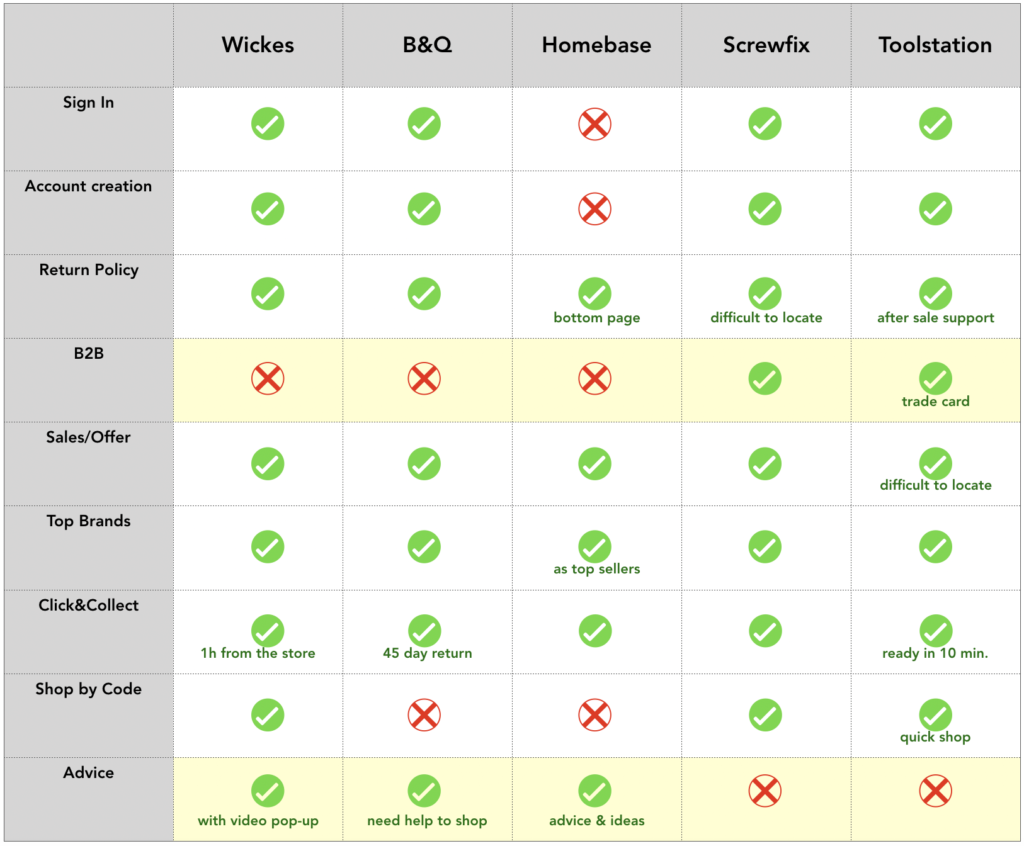
By comparing 5 of the major online hardware stores I could gain insight on how they support their clientele.
Key findings
- Sites that have good support for trades have poor help for retail customers
- Sites that provide reasonable support for retail clients offered little to trades and businesses
Phase 2 — Synthesise
User Persona
The user persona, Robert, was provided by Progress Hardware.
The given user persona was validated through the interviews:
- They all want to get quickly the products required for their work
- None of the interviwees like waiting for a long time in queues
- They don’t like speaking to staff who have little passion for their job
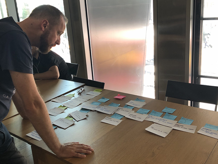
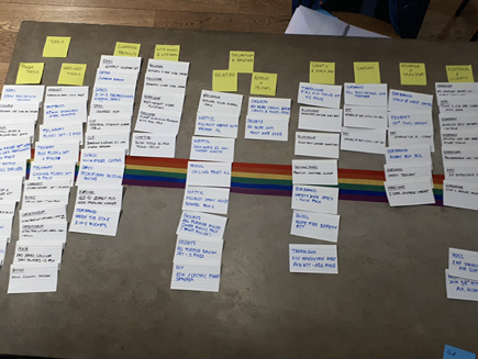
Card Sorting
Progress Hardware also provided a sample list of their product inventory.
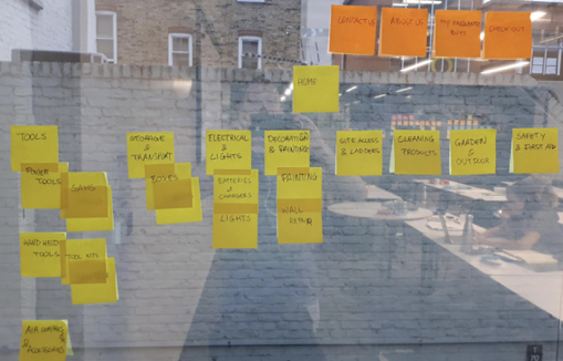
This was used to run two card sorting workshops, one for an open card sorting and a subsequent one for a closed card sorting.
Open Card Sorting
Close Card Sorting
Initial Site Navigation
Phase 3 — Ideate & Design
Information Architecture
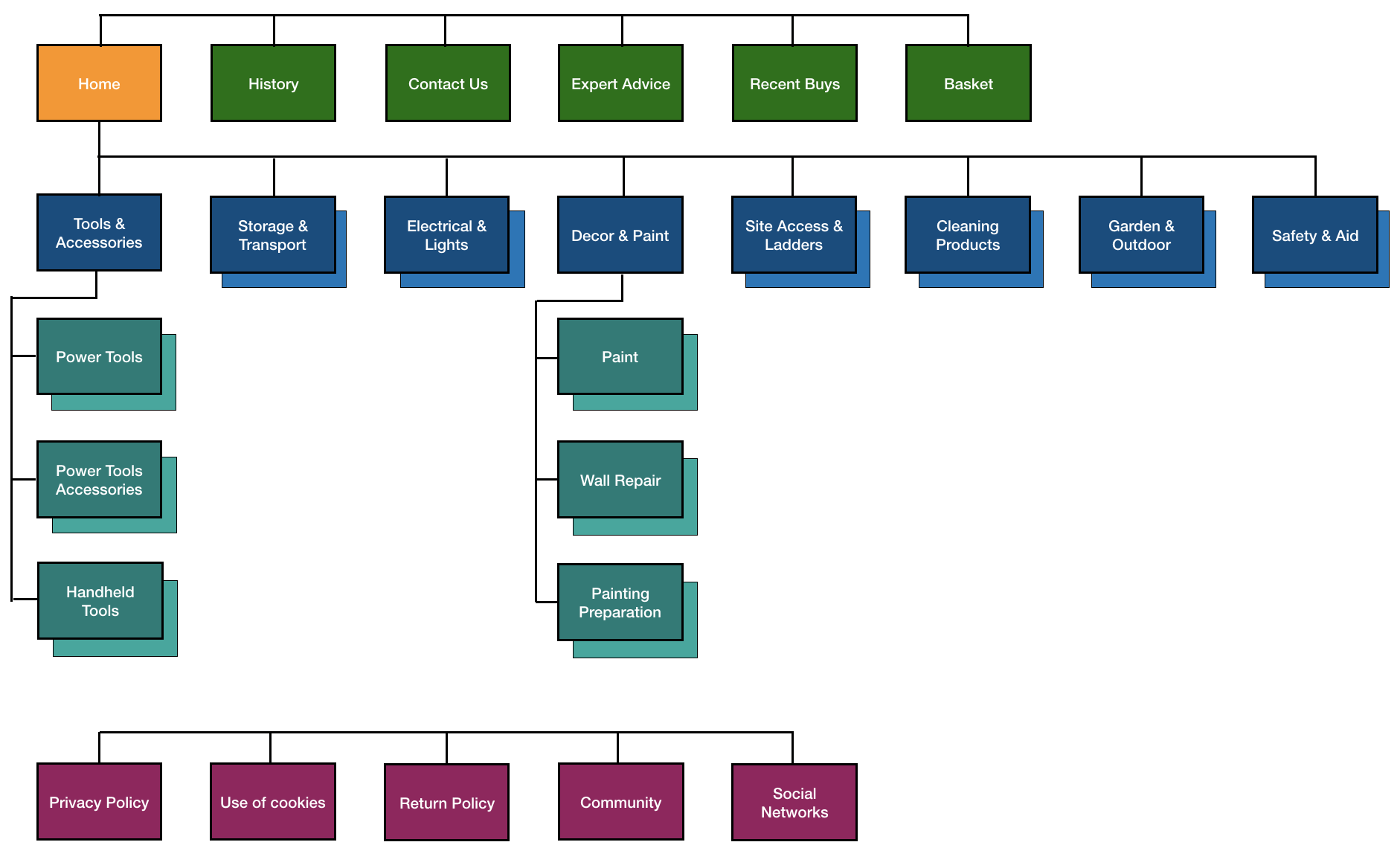
The result of the card sorting was a 3-level site navigation (Global Navigation, Product Navigation and Footer Navigation) and the site map.
User Flow
In the brief, for my solution I was given 3 scenarios that I could choose from in order to create my user flow.
I chose the following scenario:
Robert quickly needs to put in an order for some circular saw blades to be delivered on site

The happy path represents the smallest number of steps required by Robert to achieve his goal. Below it is shown in a dark shade:

Phase 4 – Prototyping & Execute
Wireframes
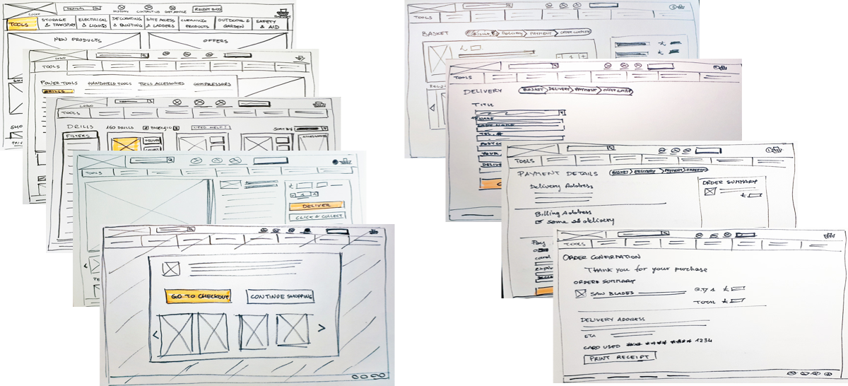
I then sketched a number of wireframes that provided me with some visual ideas on how to present the essential elements that are needed in each page, and to define how the wireflow would work.
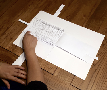
Paper Prototype Usability Testing
An important step for validating my design and ideas was to test and iterate my initial set of low-fidelity wireframes with 4 participants.
Phase 5: Mock Ups & Usability Testing
Mid-Fi Prototype
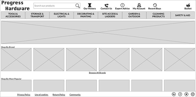
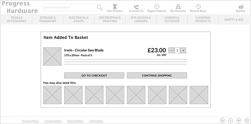
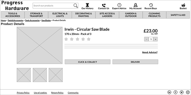
Once I was happy with the feedback that I received about the paper prototype, by using Sketch I created all the mid-fidelity digital wireframes that were then turned into a interactive prototype using InVision.
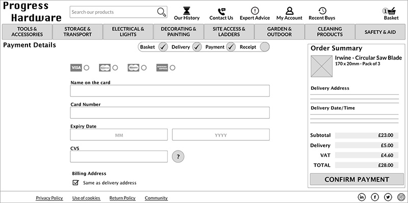
Mid-Fi Usability Testing
I decided to go through a set of 4 test iterations to gather insight on possible usability issues that could still exist.
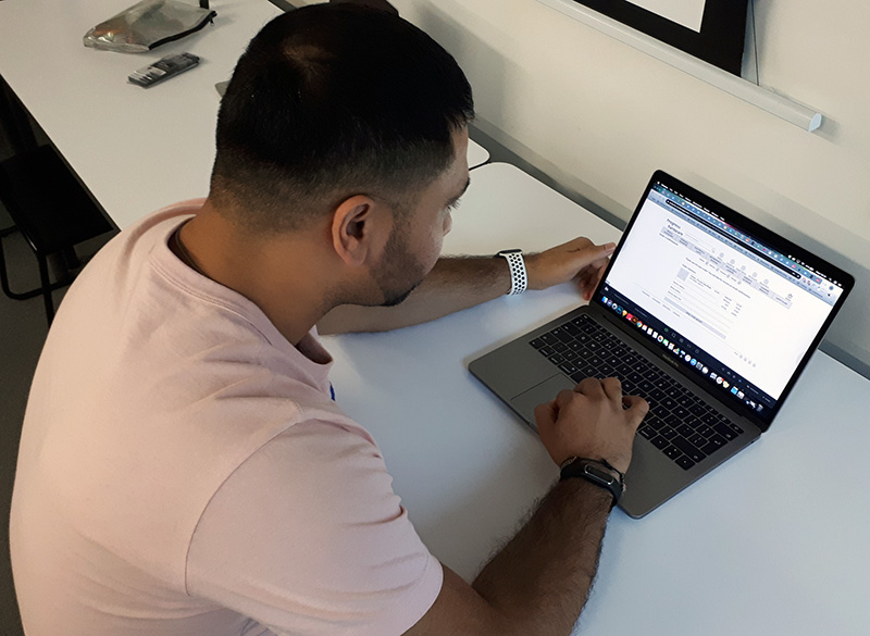
Again, the precious feedback allowed me to further improve my design.
Solution
Achievements
As per the brief requirements, the following was achieved:
- A clear way of locating products and navigating
- Products purchase done through an efficient and intuitive number of steps
- Brands and popular items are present on the homepage
- Suggestions are made through the purchase process
- Progress Hardware expert advice accessible from the global navigation
- Company social networks, community information and the return policy accessible via footer navigation
Next Steps
In order to turn the current project into a proper MVP the following additional work would need to be done:
- Review screen proportions for the artboards and, possibly, develop a responsive solution
- Create a Design Guide that reflects the brand personality (knowledgeable, friendly, practical, consistent, proud)
- Port the current Mid-Fi interactive prototype to a Hi-Fi mock-up
- Iterate with business stakeholders to make sure that the proposal is in line with their expectations
- Develop the screens related to the alternative paths in the user flow
Learnings
I really enjoyed the contextual inquiry, observing people acting in the real world, and talking to them to understand their needs and frustrations.
Applying mere logic to people’s behaviours and patterns does not work: you really need to empathise with them to get to the bottom of their motivation and keep on asking questions.
Do you like what you’ve seen? Contact me on mg.uxdesign@gmail.com


